What Does Responsive Design Mean?
More than half of all website visitors come from smartphones. Responsive design ensures your website looks good on every device.
Inhaltsverzeichnis
More than half of your website visitors come from smartphones. If your site doesn't work there, you lose those people before they read a single line.
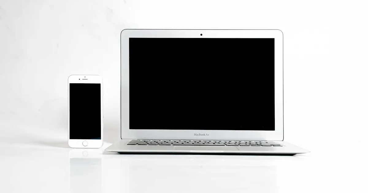
What Responsive Design Means
Responsive design means a website automatically adapts to the device it's displayed on. On a large monitor, the page uses the full width. On a tablet, content rearranges itself. On a smartphone, everything stacks vertically in a readable size.
This doesn't happen by chance. The website is programmed to detect different screen sizes and adjust the layout accordingly.
Why It Matters
More than half of all website visitors in Germany use a smartphone. In some industries, it's over 70 percent. A non-responsive website means tiny text, images that extend beyond the screen, and buttons that can't be tapped. Visitors close the page and go to your competitor.
There is a second effect as well. Google evaluates websites based on how well they work on smartphones. A non-mobile-friendly website ranks lower in search results. So you lose not only visitors but also visibility.
How to Tell If Your Website Is Responsive
- Open your website on your phone. Can you read everything without zooming?
- Are buttons and links easy to tap?
- Do images adapt to the screen width?
- Does the navigation work on a smartphone?
If you answer any of these questions with no, your website probably isn't responsive.
What We Do Differently
At Bosnar, responsive design isn't an extra. It's standard. Every website we build is developed for all devices from the start. We test on various smartphones, tablets, and screen sizes before a page goes live.
Test Your Website Now
Open your website on your phone. If it doesn't work well there, it's time for an improvement. Get in touch, and we'll take a look at your site.